At Grew Studio, we’ve come to recognise the synergy between branding and graphics integration as paramount in nurturing visual brand consistency. The art of graphic design for brand identity shouldn’t be undervalued, operating much like silent architecture within the brand’s framework. Our CEO, Adam Oliver Kollar, upholds that each graphical detail, be it a logo, typographic style or colour scheme, contributes significantly to a brand’s narrative, akin to the quiet yet powerful identity markers in our personal lives.
With the adept creation of a brand style guide, we set forth a compass that aligns the brand’s visual journey across all forms of communication. Indeed, it is this meticulous attention to detail that sets our clients apart in the saturated marketplaces where uniqueness and familiarity must coexist in harmony.
Key Takeaways
- The essence of effective branding is seamless integration of graphics and identity.
- Visual brand consistency is crucial for recognition and customer loyalty.
- A brand style guide is a fundamental tool for maintaining cohesive visual communication.
- Graphic design for brand identity shapes the brand narrative and visual impact.
- Every visual element, chosen with intent, weaves into the broader story of a brand.
- Adam Oliver Kollar’s leadership at Grew Studio ensures that branding elevates to an art form.
The Significance of Visual Identity in Branding
At the heart of our discourse lies the inextricable link between brand identity design and the visual elements that inform it. A well-crafted visual identity is pivotal, serving as the visual voice of a brand, echoing its core values and mission coherently across various mediums. As we delve deeper into the facets that define and differentiate visual identity, it becomes clear that maintaining visual brand consistency is not a mere option, but an imperative for successful branding.
Defining Visual Identity
Visual identity is the visual aspect of branding that businesses create in order to evoke certain feelings and experiences with the brand. It’s a blend of visual elements such as logo integration, brand colors in graphics, and brand typography in visuals, all harmoniously combined to build a unique image in the consumer’s mind. It’s this image that helps in distinguishing a brand from its competitors and forms the basis of brand recognition and preference.
Visual Identity Versus Brand Identity
While visual identity forms part of the overall brand identity, it is specifically concerned with the aesthetic appeal and the graphical elements of a brand. A strong visual identity will align with the broader brand identity, which encompasses the messages, values, and emotional experiences associated with the brand. In our commitment to fostering brand growth, we assert that a robust visual identity serves as the bedrock upon which lasting brand identities are built.
Our initiative, Grew Studio, offers targeted consultations to enhance visual identities through strategic assessment and design. Centred on our extensive experience and commitment to quality, we assure the creation of visuals that not only resonate with your target audience but also epitomise the essence of your brand.
| Element | Purpose in Visual Identity | Impact on Brand Perception |
|---|---|---|
| Logo | Represents the brand at a glance | Facilitates immediate recognition and recalls |
| Brand Colors | Conveys emotional and psychological associations | Influences mood and forms associative memories |
| Typography | Communicates the brand voice through written word | Enhances readability and reinforces brand personality |
Let us be your guides in navigating the landscape of brand identity design. Together, we can achieve that quintessential visual brand consistency, integrating your values and narrative into a visual language that speaks loudly and clearly to your audience.
First Impressions: The Impact of Graphic Elements on Brand Perception
In today’s fast-paced digital landscape, brand recognition through graphics is absolutely vital. We, at Grew Studio, hold steadfast the belief that you never get a second chance to make a first impression. The moment a prospective client encounters your brand graphics on websites or marketing materials, their judgment is in progress. If the graphic elements align seamlessly with the essence of your brand, the probability of securing their loyalty soars.
Consider the last time you landed on a website with harmonious and influential brand graphics. Did it not immediately convey a level of professionalism and trustworthiness? That is the calibre of work we commit to delivering. Engaging brand graphics in marketing can make the subtle but compelling difference, turning potential leads into devoted customers.
Let’s look at a comparative analysis of how graphic elements can enhance brand perception:
| Aspect | Without Brand Graphics | With Cohesive Brand Graphics |
|---|---|---|
| Website First Impression | Lacks persona, feels generic | Inviting, exudes brand personality |
| Product Packaging | Fails to stand out on the shelf | Catches the eye, encourages purchase |
| Marketing Materials | Unmemorable, easily overlooked | Striking, creates lasting impression |
| Social Media Presence | Inconsistent, confuses audience | Consistent, fosters brand loyalty |
| Company Credibility | Questions of quality and reliability arise | Increases trust and professionalism |
Our goal at Grew Studio is to usher in a new dawn for your brand, where graphical excellence isn’t merely a wish—it’s a tangible reality. We encourage you to reflect up this data and consider the transformative potential that brand graphics on websites and other mediums possess for making indelible marks in the minds of your clients.
Understanding the Role of Colour in Brand Identity Design
At Grew Studio, we recognise the enormity of colour’s impact on a brand’s identity. Meticulously selected hues embody the essence of your brand’s narrative, influencing consumer behaviour and perceptions. Let’s explore how the intricate psychology of colour plays an integral role in crafting a compelling brand identity.
The Psychology of Colours
The psychological power of colour is undeniable; each tone and shade translates to a unique emotional experience. Studies in colour psychology in branding have shown us that choosing the right colours can not only enhance brand recognition but also influence customer engagement. Our team focuses on pairing your brand’s values with the appropriate colour choices to evoke the desired emotions and responses.
Choosing Your Brand’s Colour Palette
Selecting your brand’s colour palette is not a mere aesthetic decision—it’s a strategic one. It’s an essential aspect of the brand style guide that dictates consistency across all marketing channels, from graphics on websites to print materials. Our process involves collaborative workshops to identify which colours best represent the unique qualities and aspirations of your brand.
| Colour | Psychological Impact | Typical Use In Branding |
|---|---|---|
| Red | Excitement, Passion, Urgency | Call to Action, Sale Announcements |
| Blue | Trust, Security, Calm | Finance, Healthcare, Technology |
| Green | Growth, Health, Sustainability | Eco-friendly Product Lines, Organic Foods |
| Yellow | Optimism, Energy, Cheerfulness | Children’s Products, Leisure Activities |
| Purple | Luxury, Creativity, Mystery | Beauty Products, Artistic Services |
| Black | Sophistication, Elegance, Power | Luxury Goods, High-end Electronics |
Integrating Graphics with Brand Identity
At Grew Studio, our approach to developing a strong brand identity hinges on the seamless integration of graphic elements in branding. Irrespective of the medium—whether it’s brand graphics in digital media or brand graphics in print media—our focus remains on crafting visuals that embody the essence of your brand while ensuring consistency across all platforms.
Fundamental Graphic Design Principles
We advocate utilising fundamental design principles to create visuals that are as engaging as they are cohesive. Repetition, contrast, hierarchy, and balance form the pillars of our design strategy. These principles are crucial, as they help to forge a visual language for your brand that is both recognisable and memorable.
- Repetition: to reinforce core brand elements.
- Contrast: to draw attention and focus.
- Hierarchy: to guide the customer’s journey through your branding.
- Balance: to create visual stability and harmony.
Consistency Across All Platforms
Consistency in brand imagery fortifies brand recognition—a truth we hold paramount at Grew Studio. Whether on a website, a digital advertisement, or printed brochures, maintaining a uniform appearance helps in building trust with your target audience. It communicates reliability and professionalism, key tenets in the modern marketplace.
| Medium | Application | Relevance |
|---|---|---|
| Digital Media | Website design, Social media | Engages and attracts online audience |
| Print Media | Brochures, Business cards | Physical touchpoint for brand recall |
| Mixed Media | Merchandising, Packaging | Blends online presence with tangible products |
Our dedication to preserving the integrity of your brand’s identity is seen in our meticulous attention to detail—every pixel and every typeface. We invite you to experience the Grew Studio difference: where your branding is tailored to not just represent, but captivate.

Developing a Distinctive Brand Logo Design
In the realm of brand identity design, the significance of a unique brand logo design cannot be overemphasised. At Grew Studio, we champion the creation of logos that are not just symbols but the beacons of a brand’s essence. A logo should transcend mere aesthetics; it should be pivotal in logo integration into various media, ensuring a seamless narrative across all customer touchpoints.

Features of an Effective Brand Logo
An effective logo communicates more than your brand’s name; it’s the foundation upon which customer associations and emotional connections are built. We ensure that each design feature—simplicity, versatility, recognisability, and timelessness—imbues your brand logo with an intrinsic memorability while remaining functional across a diversity of platforms.
- Simplicity: A clear and concise design for immediate recognition.
- Versatility: Scalable and adaptable to various backgrounds and sizes.
- Recognisability: Reflecting your brand’s unique character to stand out in the market.
- Timelessness: Enduring relevance, transcending current trends.
The Process of Logo Integration
The process of logo integration is a strategic endeavor, pivotal in ensuring that your brand logo not only looks good but serves its purpose across all branding points. Our method employs a holistic view, aligning the logo design with your brand’s overarching visual strategy, thus fortifying its narrative and presence in the competitive landscape.
- Assessment of the brand’s core values and messaging.
- Conceptualisation and sketching of initial logo ideas.
- Refinement of designs based on feedback and brand strategy alignment.
- Adaptation of the final logo to different formats for comprehensive brand integration.
We at Grew Studio maintain a dedication to crafting a brand logo design that exemplifies your brand’s identity, harmoniously integrating with your established image, and resonating with your target audience.
Tailoring Typography to Enhance Your Brand’s Visual Language
At Grew Studio, we are committed to elevating your brand identity design through meticulous selection and implementation of brand typography in visuals. Understanding the power of type to convey personality and emotion, we work closely with our clients to ensure their typographic decisions are synchronised with their brand ethos and audience expectations.
Typography in brand visuals does more than simply relay information; it sets the tone and engages the audience on a subliminal level. Your brand style guide, which we help to develop, serves as a roadmap for consistent typography use that fortifies your brand identity across all platforms and mediums.
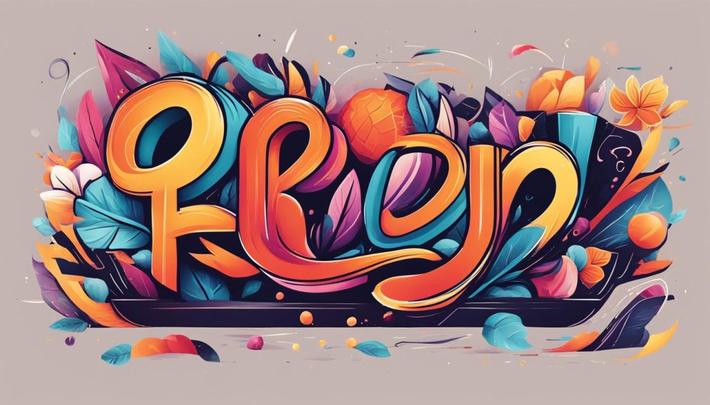
Emphasized through a careful curation of typefaces, our tailored typography strategies incorporate several elements:
- Font Selection: Whether it’s a robust serif, a clean sans-serif, or a bespoke creation, we choose fonts that reflect your brand’s character and resonate with your target demographic.
- Font Pairing: Harmonising multiple typefaces can enhance readability and visual appeal. We ensure that all font pairings within your visuals complement each other seamlessly.
- Consistency: Through rigorous adherence to your brand style guide, we maintain typographic uniformity that cements brand recognition and trust.
- Readability: Prioritising legibility and accessibility, we balance aesthetic with function, ensuring that every word communicates clearly.
- Spatial Awareness: We pay close attention to kerning, leading, and tracking, so that the text not only looks aesthetically pleasing but also enhances user experience.
Let Grew Studio take the helm in manifesting your brand identity through bespoke typography that speaks directly to the hearts and minds of your audience. With a keen eye for detail and a passion for brand storytelling through design, we are poised to deliver visuals that not only stand out but also stand for something.
The Art of Balance and Contrast in Brand Graphics
At Grew Studio, our commitment to maintaining a synergistic balance in brand graphics is the cornerstone of our design philosophy. We expertly employ contrasting hues, textures, and shapes to ensure that the visual elements within your brand’s graphics stand out and garner the attention they deserve. In advertising, the use of balance and contrast is not merely about aesthetics but also about constructing a narrative that speaks directly to the consumer, anchoring them to the brand’s identity.
Crafting the Right Visual Hierarchy
The creation of a visual hierarchy within brand graphics is essential, as it guides the viewer through the brand’s story, from the most significant aspect to the supporting details. Our design brings forth a sense of order, allowing the eyes to flow naturally through the content, ensuring that all the brand elements are perceived in a coherent sequence.
Implementing Effective Contrast
Contrast in brand graphics is not only about colours but also involves the interplay of scale, shape, and typography. These elements combined create a dynamic visual impact that accentuates the central messages of your brand’s narrative. Effective use of contrast ensures that important information is highlighted and remains memorable to the viewer.
| Design Element | Role in Balance | Role in Contrast | Impact in Advertising |
|---|---|---|---|
| Colour | Creates emotional cues | Distinguishes brand components | Attracts and retains viewer attention |
| Typography | Ensures legibility and flow | Enhances readability and highlights key messages | Improves message absorption and recall |
| Shape | Aids in creating a structured layout | Sets apart different information blocks | Defines visual sections clearly for the audience |
| Size | Helps prioritise content | Draws attention to main features | Guides audience to focus on salient points |
| Texture | Adds depth and context | Provides tactile contrast and sensory interest | Invokes curiosity and tactile memory in consumers |
In summary, the unity of balance and contrast is not only fundamental in the composition of striking brand graphics but is also strategic in reinforcing the presence of your brand in the minds of consumers. It is how we, at Grew Studio, enable businesses to visualise their brand’s potential and realise their marketing goals with clarity and distinction.
Maximising Brand Consistency with a Style Guide
In the realm of branding, maintaining a harmonious and unswerving visual thread across all forms of communication is not merely beneficial; it is imperative. At Grew Studio, our prowess lies in the creation and implementation of brand style guides that serve as the cornerstone of this consistency. These guides crystallise the essence of a company’s visual elements into an easy-to-refer blueprint for brand communication, securing a uniform brand voice that echoes across marketing channels.
What to Include in a Brand Style Guide
Our brand style guides are meticulously crafted to encompass extensive details of your visual identity. This includes the precise usage guidelines for logos, defined colour palettes that elicit the perfect emotive response, and typography standards that fortify the brand’s narrative. Beyond these, we incorporate the application of brand graphics in marketing materials to ensure that every aspect of your brand’s visual identity is comprehensively documented. Such painstaking attention to detail ensures your brand conveys its story coherently, whether it be on digital screens or printed collaterals.
Ensuring Compliance with the Style Guide
To realise the benefits of these guides, ensuring compliance is fundamental. We champion the monitoring and enforcement of style guide provisions, thereby safeguarding brand consistency. By doing so, we not only preserve the integrity of the brand’s design elements but also bolster its recognition in a competitive marketplace. Our commitment to maintaining visual consistency is unyielding, as it is a pivotal factor in cultivating trust and loyalty amongst your clientele and stakeholders here in the United Kingdom.
FAQ
What does branding and graphics integration entail?
Branding and graphics integration refers to the seamless incorporation of visual elements such as logos, typography, colour schemes, and images into a brand’s identity. This ensures a cohesive and recognisable look across all marketing channels and materials, fostering a strong brand image.
How does visual brand consistency impact brand identity?
Visual brand consistency is critical to brand identity as it reinforces recognition, builds trust, and ensures that the brand is perceived as professional and reliable. Consistent use of visuals also aligns with the brand’s values and messaging, solidifying its position in the market.
Why is a brand style guide important for graphic design in brand identity?
A brand style guide is a blueprint that details how all aspects of a brand’s visual identity should be used. It ensures consistency and coherence across all mediums, which is essential for maintaining the integrity of the brand identity and supporting its recognition and differentiation.
What distinguishes visual identity from brand identity?
Visual identity is a subset of brand identity focused on the visual aspects that form a brand’s public face, such as logos, colours, and typography. Brand identity encompasses these visual elements plus the overall essence of the brand, including its voice, values, and personality.
How do graphic elements like a logo affect a customer’s first impression of a brand?
Graphic elements like a logo play a crucial role in forming a customer’s first impression as they convey the brand’s professionalism, quality, and character. An impactful logo can establish brand recognition and influence the perceived credibility of a business from the outset.
Can the psychology of colours really affect a brand’s image?
Absolutely. Different colours evoke particular emotions and associations, which can significantly impact a consumer’s perception of a brand. Colour psychology is leveraged to align a brand’s colour palette with its desired image and messaging.
How do we choose the right colour palette for a brand?
Choosing a brand’s colour palette involves understanding the brand’s voice, values, and the emotions it aims to evoke. Considering the psychological impact of colours, competing brand colours, and cultural associations also plays a part in selecting the appropriate palette.
What fundamental graphic design principles are important for branding?
Key graphic design principles essential for branding include repetition, contrast, alignment, proximity, balance, and hierarchy. These principles ensure that the visuals are appealing, coherent, and effectively communicate the brand’s message.
Why is consistency across all platforms important when integrating graphics with brand identity?
Consistency ensures that customers receive the same brand experience, whether they are interacting with the brand online or offline. It reinforces brand recognition, builds credibility, and supports trustworthiness, greatly impacting customer loyalty.
What are the features of an effective brand logo?
An effective brand logo is simple, memorable, scalable, appropriate for the target audience, and reflective of the brand’s essence. It should work well in varying sizes and across different mediums, from digital to print.
How do you integrate a logo into a brand’s broader visual strategy?
Integrating a logo involves ensuring it complements the brand’s colour scheme, typography, and other visual elements. It should be placed consistently across all marketing materials, and its usage guided by the specifications in the brand style guide.
Why is tailored typography important for a brand’s visual language?
Tailored typography reinforces the brand’s unique voice and helps to set the tone for its communications. The right choice of fonts can express the brand’s personality, support readability, and help establish a strong visual hierarchy in texts.
What does crafting the right visual hierarchy entail?
Crafting the right visual hierarchy involves organising design elements so that the most important ones capture the viewer’s attention first. This directs the viewer’s journey through the material, ensuring they receive the message in the intended order of importance.
What role does implementing effective contrast play in brand graphics?
Implementing effective contrast ensures that essential elements stand out and are easily distinguishable by the viewer. Contrast can be used to highlight calls to action, bring attention to specific messages, and create visual interest in brand materials.
What should be included in a brand style guide?
A brand style guide should include guidelines on the use of the logo, colour palette, typography, imagery, iconography, and any other graphic elements. It should also provide instructions for the application of these elements across various media and contexts.
How do we ensure compliance with the brand style guide?
Compliance is ensured through regular training sessions for staff, auditing marketing materials for adherence, and incorporating style guide reviews into the design process. It’s also essential to update the guide as the brand evolves and ensure all stakeholders have access to the latest version.

